The importance of color contrast in digital accessibility
Posted on
In order for a website to be ADA compliant, text, user interface (UI) elements, and graphics that convey information must provide sufficient contrast ratios. According to the Cleveland Clinic, around 300 million people around the world have some form of color blindness. Unfortunately, color contrast is one of the most common defects we report in our web accessibility audits.
Color contrast refers to the difference in luminance of two colors. Your choice of difference in colors can prevent people from interacting with your website and consuming your content.

WCAG color contrast requirements
The Web Content Accessibility Guidelines (WCAG) provide standards for contrast ratios and how we use color in our digital content. WCAG states that sufficient color contrast for regular text must provide at least a 4.5:1 ratio. If the text is large (about 18.66 px and bold or larger or 24px or larger), the ratio requirement is 3:1.
Color contrast is a measure between the brightness of two colors ranging from 1:1 (this would be a color against itself) and 21:1 (e.g., black against white).
For example, if the background of a website is white and the text color is green #027667, the contrast ratio is 5.5:1.
This green text provides sufficient color contrast.
If some areas of the website use a dark blue, such as #083667, the green #027667 text only provides a 2.9:1 ratio which does not provide sufficient contrast.
This green text provides sufficient color contrast.
While any good designer will obviously (hopefully) not use this specific combination, it is not as obvious when the colors almost provide sufficient contrast.
If we use the same green #027667 on a light blue #c8ddfc background, the contrast ratio is 4.01:1.
This green text does not provide sufficient color contrast unless the text is large.
While some users may be able to see this green text, users with color contrast deficiencies will struggle to see it. Using this green/blue color combination results in a WCAG failure and an inaccessible website.
WCAG also provides guidance for non-text contrast. Non-text contrast refers to UI components such as form field borders and graphical objects such as chart elements. The visual presentation of these elements must have a contrast ratio of at least 3:1 against their adjacent colors.
Besides color accessibility guidelines, WCAG also addresses how we use color. We cannot use only color to convey information. For example, while we can use a different color for linked text, we must use an additional link indicator such as an underline. Although we recommend underlining text links, an additional indicator does not need to be provided if the linked text provides at least a 3:1 contrast ratio against its surrounding text.
As you can see, there are multiple considerations when selecting colors for web design other than simple text against a background.
Color contrast in web design
The best web designers understand that colors are not only important to branding, but are vital to the overall accessibility of a website. Web designers who balance branding with sufficient color contrast create the best website user experience.
Since color contrast is best addressed during the initial discovery and design phase, designers must consider color contrast as they create mockups for websites. Doing so helps to ensure that developers do not have to restyle colors after they have already received approval. In other words, when a developer receives the final designs, all colors should already provide sufficient contrast.
We find that most colors used on websites derive from logos and other branding graphics. While this is important for branding purposes, it is just as important to understand how to use the colors in an accessible way, especially when they do not provide sufficient contrast against common website background colors such as variations of white.
Since not all branding colors will provide sufficient contrast, it is up to the designer to incorporate the harder-to-pass colors in other decorative ways. An easy way to accomplish this is by using colors that do not provide sufficient contrast as secondary colors. This can be accomplished by using them for design elements such as accents like lines and borders.
Note that WCAG does not require logotypes themselves to provide sufficient color contrast. However, if you are in the process of creating your logo, we recommend considering using colors that do provide sufficient contrast against various shades of white or other common background colors. This will not only allow all users to clearly see your logo, but it will also make it easier for your website designers to incorporate branding colors in your website and other marketing materials.
We’ve posted free resources to help you learn and apply web accessibility into your workflow.
Reasons contrast matters for accessibility
The color contrast that we provide on a website matters not just because it is a legal requirement, but also, and more importantly, because of how it affects our users. First, if we do not provide sufficient color contrast, we create user barriers. As a result, not all users can read the contents of the website. If the content is not important enough for all users, maybe it’s not important enough for any users and should not be included on the website at all.
Since color is a large part of branding, choosing colors with good contrast to use for your branding not only provides access to more users, it also creates a personality for your business or organization. Have you ever noticed how many apps on your smartphone are blue? This is intentional since blue symbolizes trust, strength, and dependability.
By choosing a color such as blue that provides good contrast, you accomplish more than displaying a positive personality. You also allow more users to see and interact with your content. Additionally, by providing sufficient color contrast, you also set a standard of inclusiveness.
Another example of why color contrast is important for accessibility is when color is used to convey information such as in charts or graphs. Charts are a decorative way to display data so that it is easy to understand. That is, as long as users can see the data.
The charts below show the number of ADA Title III website accessibility lawsuits in the U.S. federal court for the years 2020 through 2022.
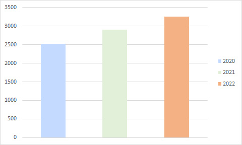
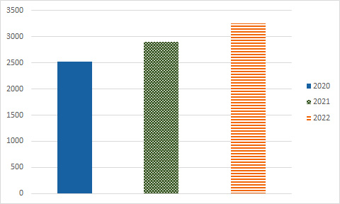
[Total Number of ADA Title III Federal Lawsuits Filed Each Year January 1, 2020 – December 31, 2022: 2020: 10,982; 2021: 11,452; 2022: 8,694] Data provided by Seyfarth’s ADA TItle III team.
Notice how the first chart below uses only color to distinguish between the annual totals. Not only is this considered an improper use of color, but it is also a color contrast failure because the colors do not provide sufficient contrast against the white background or each other.
The second chart uses color and shape to distinguish the difference between each year. The blue, green, and orange colors in the second chart also provide sufficient contrast against the white background. The various designs used to distinguish the years help those who may not be able to distinguish the variations in color. The second chart provides accessible content that is easier for all users to understand resulting in a better user experience.
Sufficient color contrast on form elements is another aspect of a website that matters when it comes to providing good color contrast. Form elements must provide at least a 3:1 contrast against background colors. Providing proper color contrast ratios on form elements ensures that all users know where to select to enter input.
Websites with good contrast: what do they share?
Websites that follow color accessibility guidelines and provide good contrast share at least three important benefits.
- They promote inclusiveness.
- They reach the widest audience.
- They protect themselves against accessibility lawsuits.
These three benefits are always topics of discussion for those looking to grow their business. Successful companies strategically select colors with good contrast that enhances readability.
By adhering to guidelines for color contrast and accessibility, a website provides the essential accessibility needed to allow users to easily perceive and interact with content. Providing this inclusive and user-friendly experience creates the best environment for successful digital accessibility.
Contact Us
Please complete all fields.
Recent Posts

Screen Reader Users Statistics, Market Share and Survey Data
Screen readers are among the most critical tools in digital accessibility. They convert on-screen text, images, and interface elements into synthesized speech, enabling people who are blind, have low vision, or have other print-related disabilities to navigate the web independently. This page compiles the most current screen reader usage statistics. […]

Keyboard Accessibility for Better Website Navigation
Keyboard accessibility allows users to navigate and interact with a website without using a mouse. Many people rely on keyboards because of physical disabilities, temporary injuries, visual impairments, or personal browsing preferences. When websites do not support proper keyboard interaction, users can struggle to access menus, forms, buttons, and other […]

Americans with Disabilities Act Statistics and Trends
ADA lawsuit statistics reveal a consistent pattern: website accessibility litigation has grown every year since 2017 and shows no signs of slowing down. As websites increasingly function as the primary customer touchpoint, accessibility lawsuits now affect businesses of every size rather than only large national brands. In 2025, plaintiffs filed […]