The Problems with Accessibility Overlays (Plus Failure Examples)
If accessibility overlays are so bad, why do they continue to sell? The best answers that we can provide are large marketing budgets from overlay companies and a lack of understanding from business owners. After all, not much sounds better than a single line of code that provides a quick and easy fix with zero web accessibility expertise to provide protection for web accessibility compliance.
Unfortunately, overlay companies continue to lie about the ability of their products to provide web accessibility and protect your business against legal complaints.
Let’s debunk the myth that an accessibility overlay can automatically fix all of your accessibility concerns. Aside from not protecting your business against lawsuits, accessibility widgets are not a solution to web accessibility.
Web accessibility is about real people with real disabilities and compliance is about equal access, not different access.

What are accessibility overlays?
Overlay solutions for accessibility are automated technologies that claim to find and fix accessibility issues on a website or app. They are usually designed in the form of a toolbar, plugin, app, or widget.
5 things accessibility overlay companies fail to tell you
Here are just a few of the many things that companies claiming to provide an automated web accessibility solution for the American’s with Disabilities Act (ADA) and the Web Content Accessibility Guidelines (WCAG) compliance fail to tell you.
- Screen reader users already have their own screen readers. Forcing blind users to use a screen reader that they are not familiar with would be extremely difficult. Compare this to iPhone users attempting to use an Android device and vice versa.
- Accessibility conformance does not require you to provide a way for users to increase text size, adjust colors, or make content adjustments in order for them to interact with and consume the content of your website. Users should be able to interact and consume the content of your website without requiring additional assistance.
- Providing accessibility for things like accurate alternative text, semantic headings, and descriptive links cannot be automated. The last time that we checked, artificial intelligence (AI) was not able to read our minds to know the intentions of our images or headings.
- Adding a little accessibility icon to your website will not protect you from a lawsuit. In fact, it may actually attract plaintiffs who are scrolling websites to find businesses that they can complain against. (See Lighthouse for the Blind vs. ADP.)
- Simply blocking an automated testing tool from scanning your website does not make your website accessible or compliant.
If you would like to only pretend that your business cares about accessibility and attempt to give the appearance of an inclusive effort, then a web accessibility overlay may be right for you. Otherwise, you will be highly disappointed when you activate plugin only to discover that your website remains inaccessible and possibly provides less accessibility than it did prior to installing the accessibility overlay.
Examples of accessibility overlay failures
Accessibility overlay companies claim to be a quick fix for web accessibility. They promise that their widget will repair your website’s live code with a single line of code. Overlay companies claim that their AI fixes inaccessible code and provides optimizations for screen readers and keyboard navigation.
We tested a few websites that we noticed are using overlays for accessibility in hopes that AI would solve all (or at least most) of their accessibility concerns. As expected, our manual testing proved that these accessibility tools do not provide an accessible website. Sadly, accessibility overlays can only account for 20-30% of accessibility barriers.
The examples of accessibility failures that we share here are all from websites that were actively using an overlay for web accessibility.
Image alt text
Image alt text is what a screen reader uses to describe images. Image alt text is a great example of accessibility that cannot be automated. AI is just not smart enough to accurately determine the content of an image.
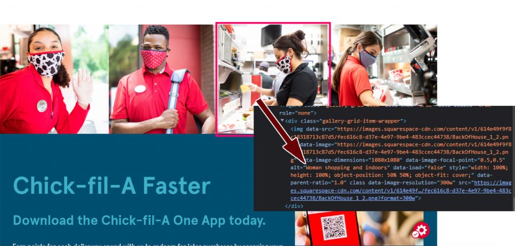
We read Chick-fil-A’s Home page with the NVDA screen reader. The screenshot below shows that the alt text presented for the image of a lady preparing a food order is “Woman shopping and indoors” which is obviously not accurate.

The website uses an accessibility overlay widget that attempts to provide an option for screen reader optimization, but activating this option still did not correct the description.
We decided to give another overlay widget a try at alt text and viewed Dealer.com’s Our Team page. The alt text on team member Candy’s profile picture is “MicrosoftTeams-image (16)-modified.” We noticed that the web accessibility overlay provides an option to display alt text. We tried using this option to see if the alt text would improve.
The screenshot below shows that all this did was display the same alt text when we hovered over the image with a mouse.

The image also had a title attribute which already displays the same text so we are not sure who this alt text display feature is intended to benefit.
Image alt text requires real humans to describe images. Alt text should be descriptive but not too verbose. Consider the purpose of the image and how you would describe the image to someone who is not looking at it. What information is the image providing? Leave out details that are not important. For example, is it important that the person in the image is wearing a brown shirt? Probably not. So you can leave that part out.
Whatever you do, do not rely on AI from accessibility overlays or widgets to automatically provide alt text.
Color contrast
The Web Content Accessibility Guidelines (WCAG) level AA requires text and background color to provide a 4.5:1 ratio for normal text (smaller than 18.66 pixels). It does not appear that accessibility overlays alter the color of text on websites by default. This means that if you have a visual color deficiency and require sufficient color contrast in order to read text, you will need to access the accessibility tool in order to update the colors.
Unfortunately, this does not provide equal access. This says that if you have a disability, go use this tool over here to see the website differently than everyone else.
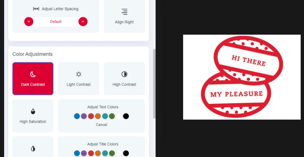
We proceeded to try and use the contrast feature provided by the accessibility overlay widget on the Chick-fil-A website in order to help see the white/green text/background combination that fails to provide sufficient color contrast.

In addition to attempting to provide other access and not equal access, it took some time for us to actually find the feature that would update the page’s contrast. We can’t see how this would be good for overall usability, but we selected the option to darken the contrast anyway.
When we expanded the accessibility widget to see the options for adjusting contrast, the widget covered the text that we wanted to read. We had to close the widget and then reopen it in order to select another contrast option. In our opinion, this was yet another usability fail.

Our expert advice is to provide sufficient color contrast for all users at all times, and avoid requiring additional steps to allow low vision users to read the contents of your website.
Headings
Web pages should use HTML headings to organize content. Headings should be in the correct semantic order, avoid skipping heading levels, and never be empty. Overlays cannot fix the order of headings on a page. Additionally, accessibility overlays cannot determine if the heading text is accurate for the content it precedes.
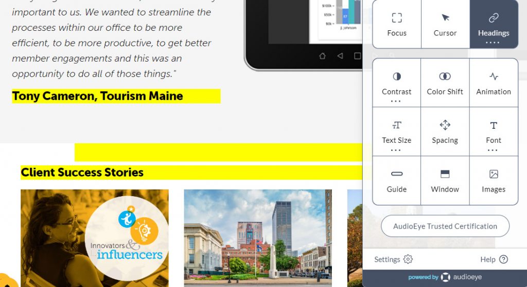
Simpleview’s website uses an accessibility widget. In addition to having empty headings and skipping heading levels, the page also uses some headings for styling instead of semantic purposes. The overlay widget provides an option to highlight headings. The empty headings display as a yellow bar without text.

Of course, if you have a visual color deficiency that requires sufficient color contrast, you would not even see the yellow bars highlighting empty headings since they do not provide enough contrast.
Invest in real web accessibility
Avoid the false sense of security, and don’t waste your budget on the empty promises of accessibility overlays. Invest in real web accessibility by natively providing an accessible website. It may actually be easier than you think.
We recommend these three steps to achieve full web accessibility:
- Complete full site web accessibility testing that includes manual, automated, and disabled user testing.
- Remove accessibility barriers discovered during the audit.
- Complete web accessibility training in order to maintain full accessibility moving forward.
People are your greatest investment. Create perspective, and be inclusive. Be intentional about your website’s accessibility. Investing in real people is the only way to ensure a positive return on your web accessibility investment.
Contact Us
Please complete all fields.
Recent Posts

How Proper Structure Improves Forms Accessibility for Screen Readers
Forms are portals to essential online services. When poorly designed, they become obstacles that frustrate screen reader users and prevent task completion. Proper structure turns forms accessibility from a checkbox into a working experience that reduces errors, builds user confidence, and allows for independent completion. Structure matters because that’s how […]

Link Accessibility for Modern Websites
Every click on a website matters. Link accessibility determines whether visitors can find what they’re looking for or struggle to find important information. For millions of people using screen readers, keyboards, or other assistive technologies, inaccessible links are barriers to content. Since modern websites rely on links to guide users, […]
How to Make Your WordPress Website Accessible
Learning how to make a website ADA-compliant within WordPress goes beyond installing plugins or applying quick fixes. True accessibility requires intentional choices at every stage of building and maintaining your site. When you prioritize accessibility, you not only reduce legal risks but also create a smoother, more inclusive experience for […]